Financial Aid Widgets
Supporting students so they can stress about their grades, not their money
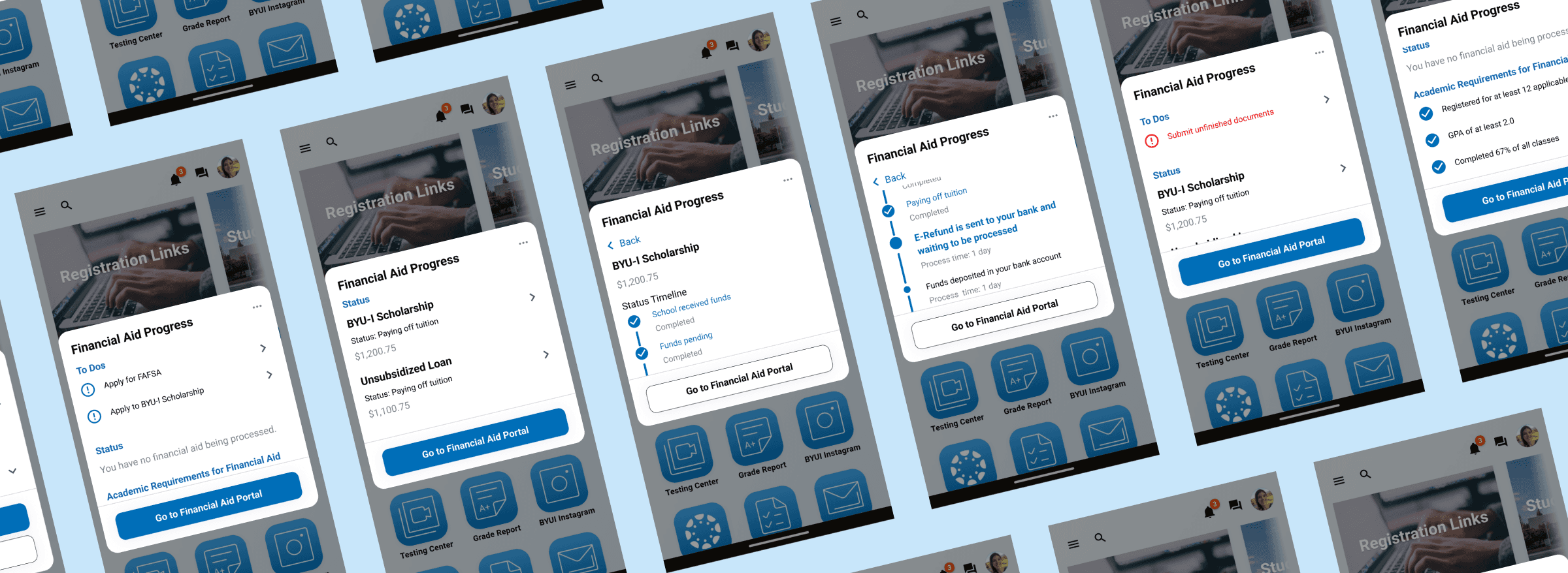
Overview
The financial aid department wants to increase the number of students applying for financial aid by adding a widget to the student dashboard. This widget will provide information about financial aid, application deadlines, and disbursement timelines.
The Problem
- Students don’t understand how or when to apply for financial aid.
- If a student has a bad experience once, they won’t apply for financial aid again
- Information about financial aid is difficult to find and hard to understand
Our Solution
- Provide students a personalized task list of what to do to get their financial aid
- Warn students about issues with their financial aid before things get stressful
- Present information in everyday terminology with an action item
Finding The Real Problem
3 Rounds of user interviews
We conducted 3 rounds of user interviews, interviewing over 30 students. We wanted to learn directly from students what the issues were, so we went around campus and asked to interview students on the spot.
There are three types of students
From our interviews, we broke down the students into three groups:
- Apathetic: When students believe that they won't qualify for financial aid, they don’t apply
- Discouraged: If students have difficulty applying in one semester, they don’t apply again.
- Self-sufficient: Many students who apply for financial aid get help from older family members or adults they trust.
With these results, we decided to target the apathetic and the discouraged. We needed to educate the apathetic and support the discouraged. However, there were so many issues that could happen when applying for financial aid. Where did students need the most support?
Breaking down the interviews' results
We knew that the answer was in the interviews. So my team broke down all the interview notes into a journey map.
But that still didn’t answer our question.
But that still didn’t answer our question.
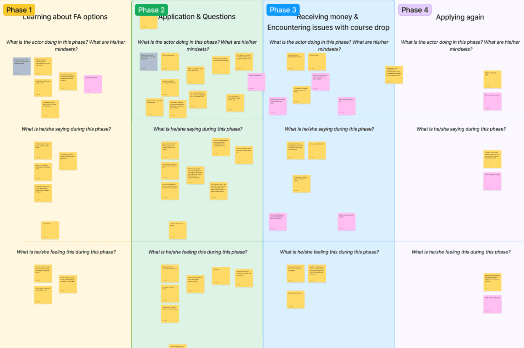
User journey map created by my two coworkers and I.
Finding the Breaking Point
My team agreed that we needed to find the breaking for the students. Where was the most stressful point in the financial aid journey?
So we took our user journey map and, using our notes from the interviews, slapped on what the students were feeling in each situation.
So we took our user journey map and, using our notes from the interviews, slapped on what the students were feeling in each situation.
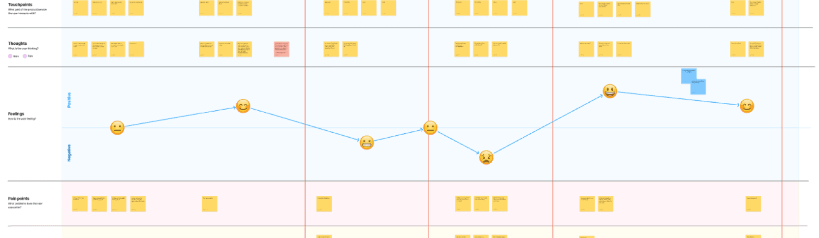
Empathy map of user journey
The most stressful moment for students was waiting for money to be deposited
The first day of school comes around and they need to pay for rent and tuition.
Students don’t understand how their money is deposited or when.
The tension and stress heighten as they wait for the money.
Money is deposited into their account.
Students pay tuition and forget everything about financial aid.
Exploring Solutions
Whiteboarding to find as many solutions as possible
My team gathered together and all sketched out as many ideas as we could in five minutes.
I like to go as wide as possible when coming up with ideas, so I created some illustrative ideas while sketching.
I like to go as wide as possible when coming up with ideas, so I created some illustrative ideas while sketching.
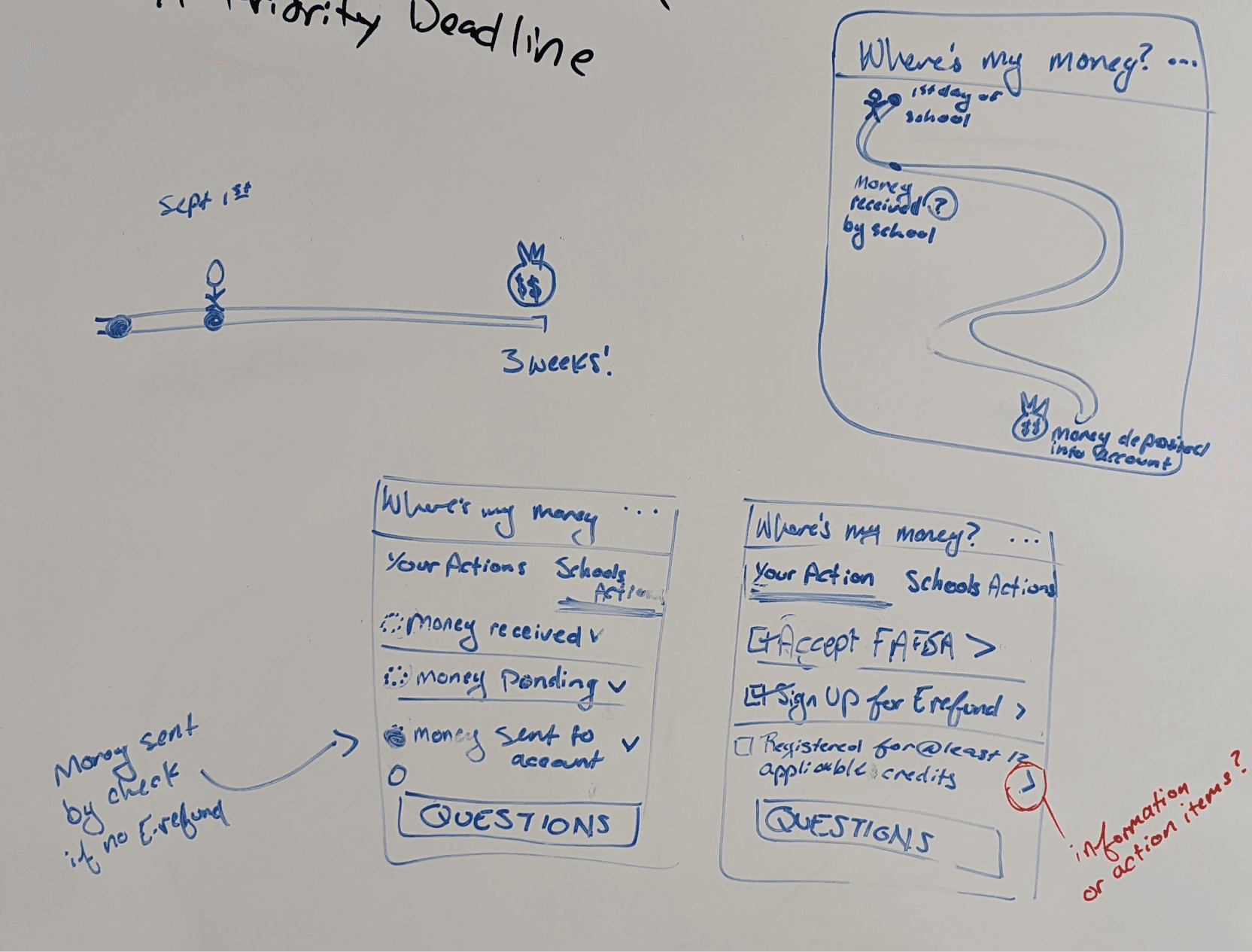
Sketches from whiteboarding exercise
After sketching, my boss directed everyone to design 3 variations of three different ideas:
- a balances widget
- an informational widget
- a timeline widget
So I went to the whiteboard and sketched out a few ideas, and then put them together in Figma.
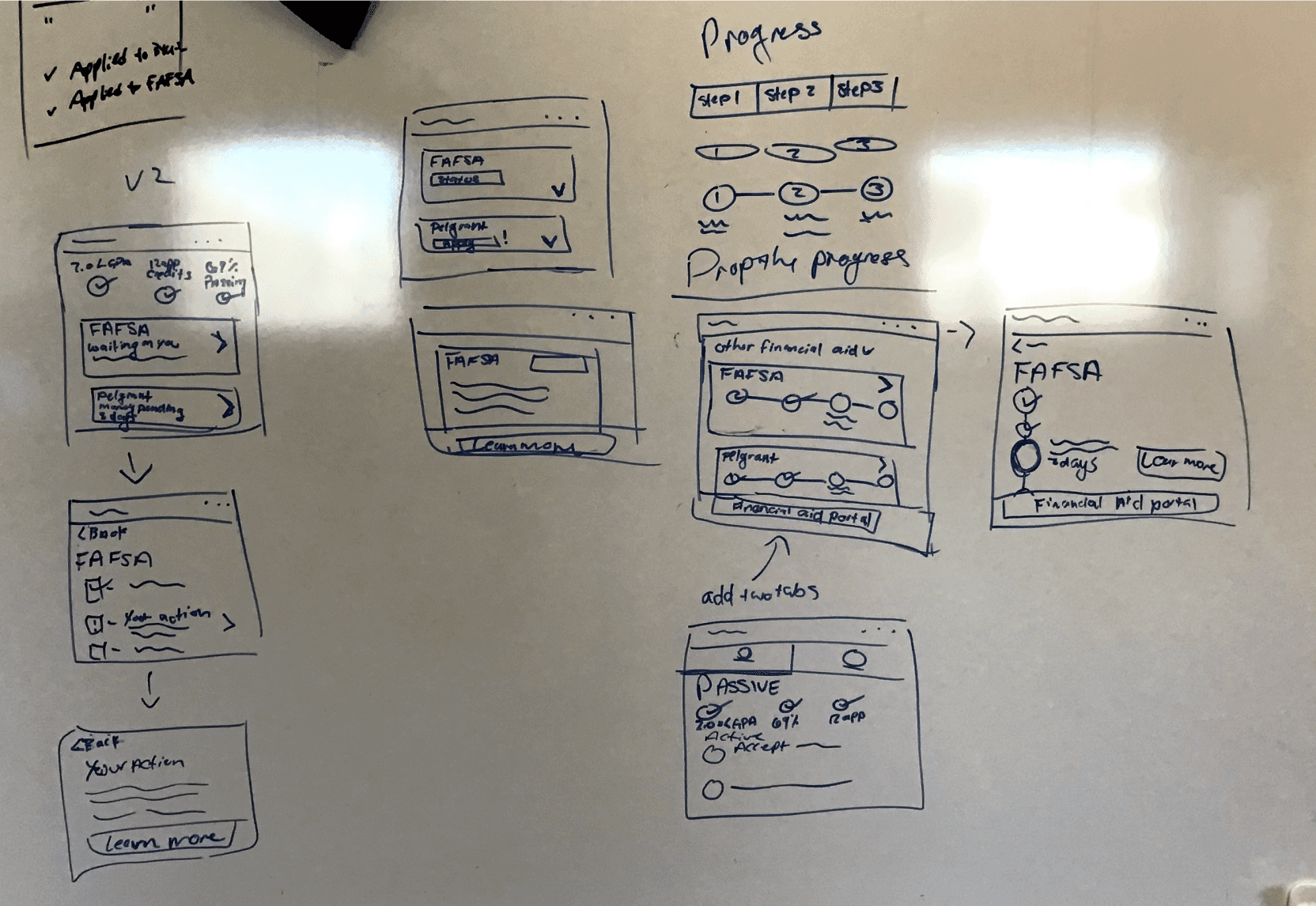
Sketches from whiteboarding exercise
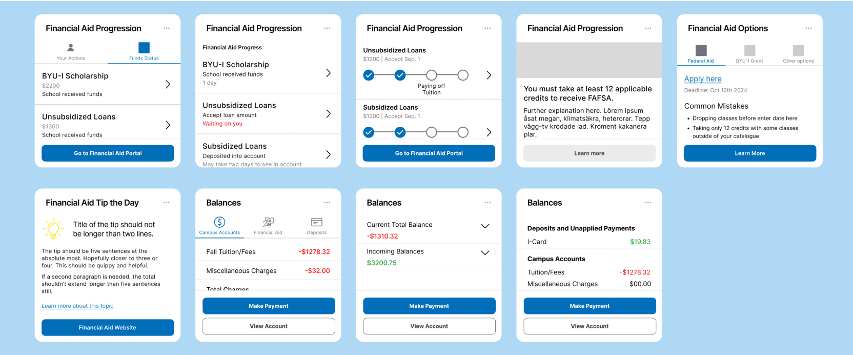
Three different variations of a progress widget, an information widget, and a balance widget.
Round 1 of Usability Testing
I wanted to find out which version of each widget was the most effective. So I created a prototype of the student dashboard with each of the three versions of the widgets on there.
I had three tasks for the students to walk through and they needed to use the widgets to finish the task.
I had three tasks for the students to walk through and they needed to use the widgets to finish the task.
Goals for First Round of Tests
- Get quick feedback on designs
- To understand if the designs are effective
- To see if we can simplify and condense information
Testing Results: students are less engaged than I thought
- Students explore widgets a lot less than I thought.
- Students hesitate to click on sideways chevrons. Do they know what it is?
- Students want information right in front of them or they won’t find it
- Overall, students were not able to find the information they needed
Changes to Progress Widget
Usability Issue
Students weren’t switching between tabs.
Design Solution
Moved all crucial information to the main page with more information on a second page.
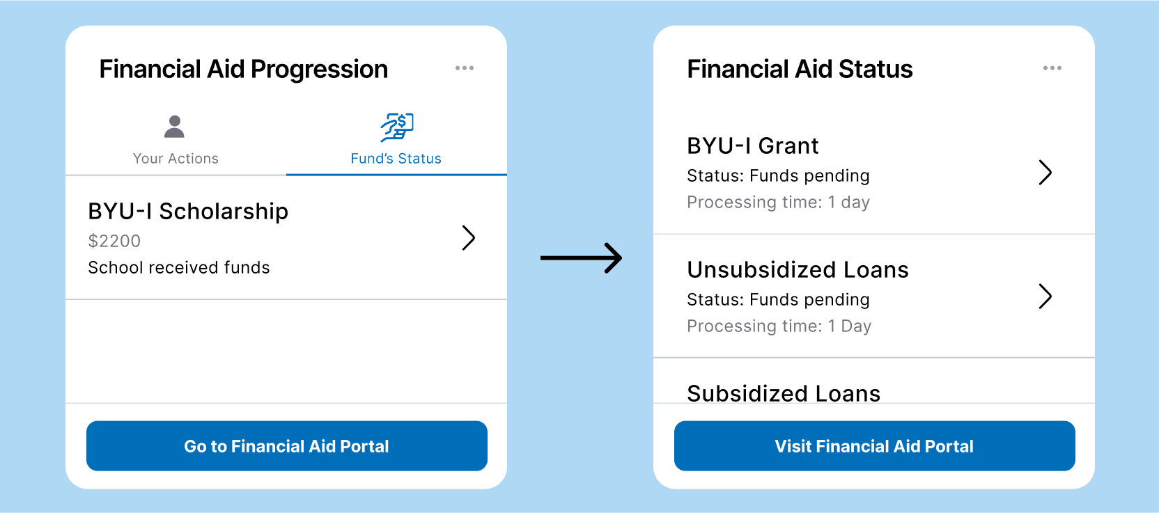
Progression Widget
Changes to Informational Widget
Usability Issue
Students weren’t switching between tabs and exploring to learn more information.
Design Solution
Information is given in a “fun fact” format where students can passively scan over the widget to learn about financial aid.
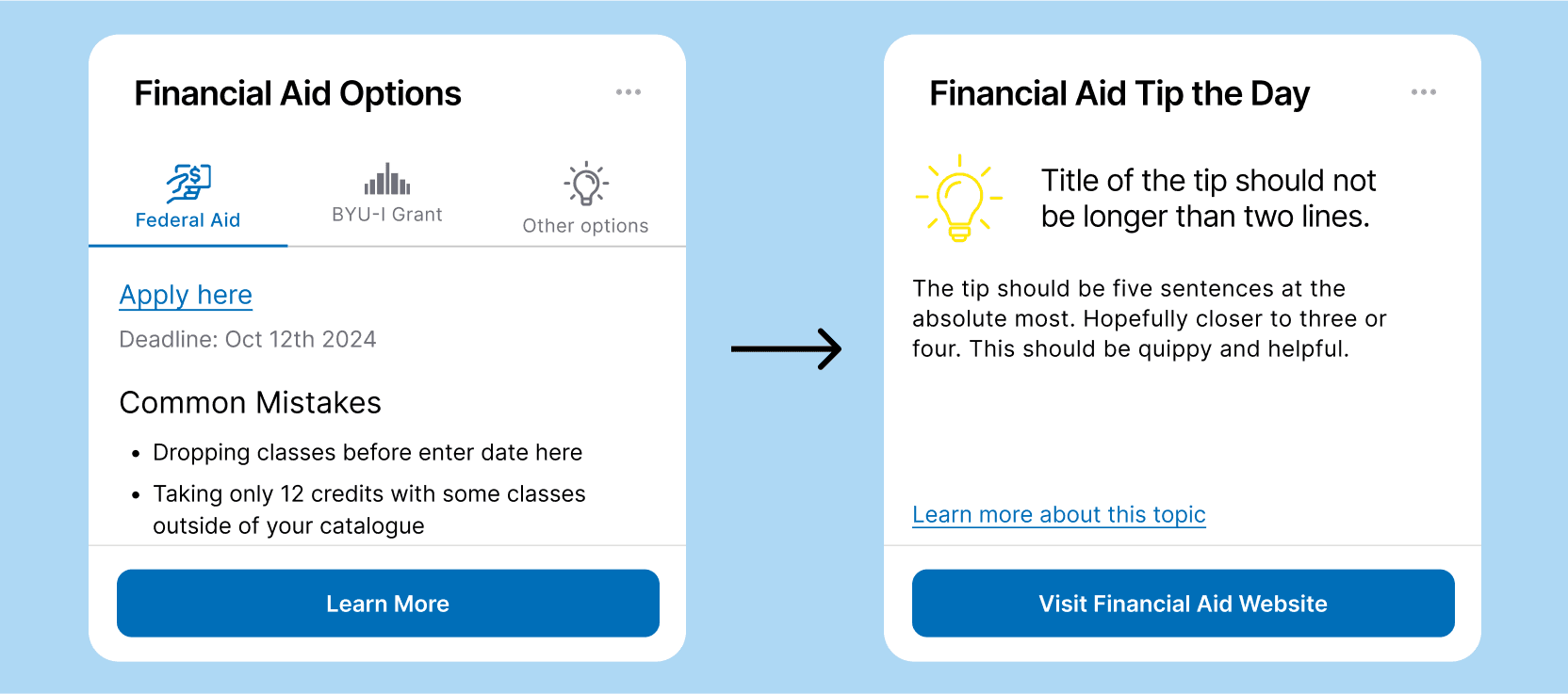
Informational Widget
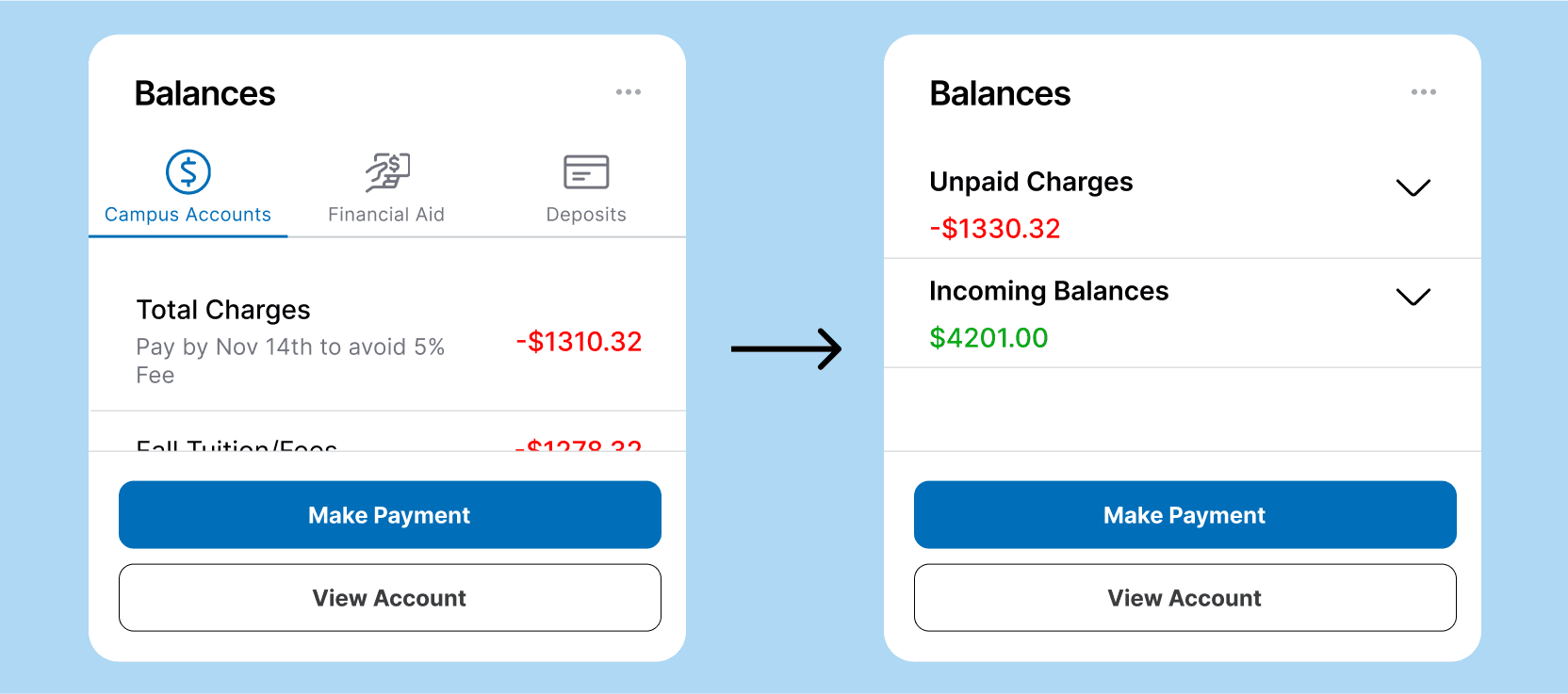
Changes to Balances Widget
Usability Issue
Students were only looking at the first tab and didn’t see the point of the other tabs.
Design Solution
Information is condensed into two sections and important information is visible at a glance.
lorem ipsum
Rounds 2-5 of Usability Tests
Usability Test Changes
At this point, my two team members left and I was the only designer and researcher left on the project.
I conducted 4 more usability tests. Through the tests, I learned how to condense the information more and more. My main goal was to show all crucial information at a glance. I removed or hid all information that wasn’t crucial to the user.
After the second round, we decided to remove the informational widget because students wouldn’t even glance at it as completing tasks.
I conducted 4 more usability tests. Through the tests, I learned how to condense the information more and more. My main goal was to show all crucial information at a glance. I removed or hid all information that wasn’t crucial to the user.
After the second round, we decided to remove the informational widget because students wouldn’t even glance at it as completing tasks.
Balances Widget
From the beginning, students loved the dropdown design. For most students, all they needed to know was how much money they owed to the school, and how much money they were receiving in student loans.
An Interesting Test Finding
I noticed that students were doing mental math to see if the money they were receiving was more than the money they owed. So I moved the unpaid charges dropdown above the incoming balances to help. Students continued to do this mental math and recognized quicker when they weren’t getting enough financial aid to pay their tuition.
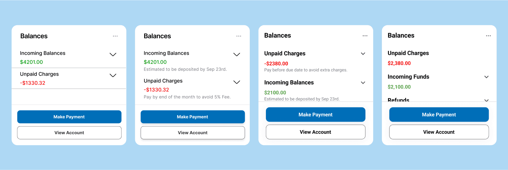
Most changes made to the balances widget were small visual adjustments.
Progress Widget
Changes Made on Main Screen from Testing
- Students weren’t seeing the tasks under To Dos, so I moved them to the top.
- Students didn’t recognize that the grey circle under To Dos was a task, so I added color and icons to nonurgent tasks
- Students didn’t pay attention to the red text under Status, so I moved the message under To-Dos
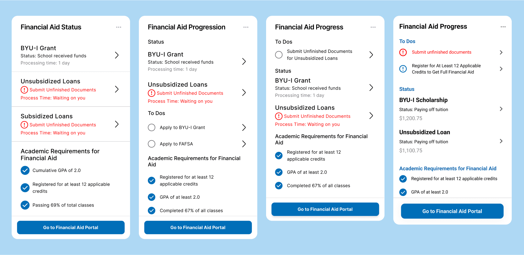
Changes made throughout usability testing on the main screen.
Changes Made to Timeline
- Removed “Current Status” because students weren't reading it.
- Students thought the timeline was a checklist, so I took inspiration from Amazon’s delivery timeline.
- Created a pending state for the timeline because students didn't know what the next phase was.
- Changed CTA to the secondary button style to help with hierarchy.
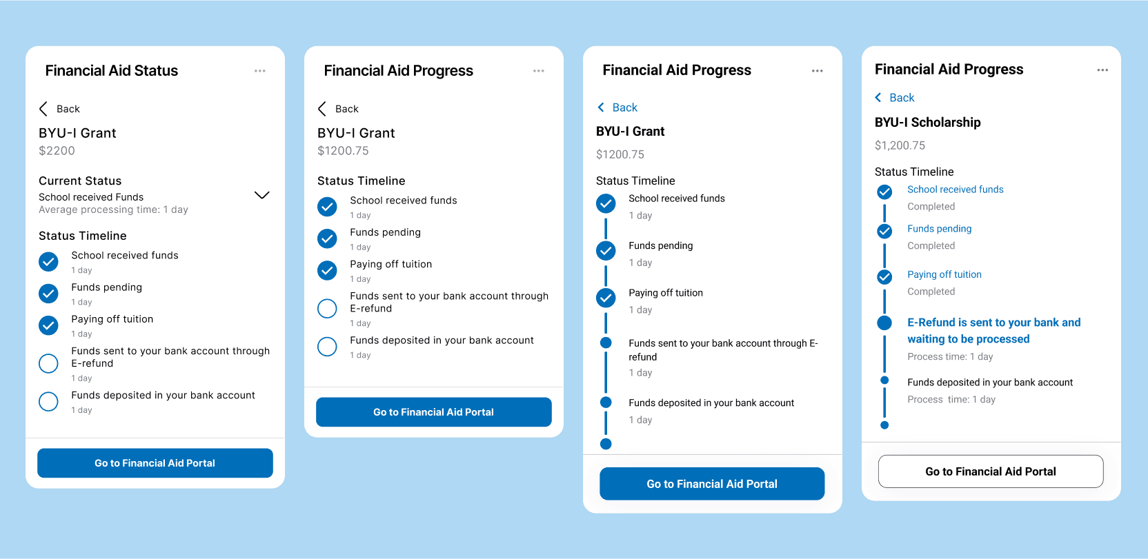
Changes made to the timeline because of usability testing.
Final Design
Students Love the New Design
By the end of testing, students were able to complete all three tasks with little difficulty. Interestingly, because we created two different widgets to reach the same goal, students completed the tasks in a variety of ways. This confirms to me that our designs reach a wide variety of students and can mold to their needs.
I’ll walk through the process below.
I’ll walk through the process below.
Learnings and Takeaways
The stronger the research, the stronger the solution.
The only reason we got to the final designs was because of the 50+ plus students we interviewed and tested with. Their honest answers and experiences directly led us to the best solution to help the students.
How to communicate with stakeholders
I was a part of one and led two more crucial meetings with stakeholders. While preparing for and participating in the presentations, I learned a part of how to effectively share our findings and how to receive feedback from stakeholders.
Don’t be afraid to ask your team for help
What I didn’t include in this case study was the countless hours of asking my other team members for their feedback. I’m very lucky to have worked with such an amazing team.
About
What I do
Problem Solver
Uncovering the problem
The goal of any design project is to solve a problem. Whether that’s updating a homepage to increase conversions, creating a landing page to inform about a product, or simply make something more beautiful. But to find the most effective solution, you have to find out what the true problem is.
Designer
Organize information
My passion always lies with design. I thrive on the feeling of taking chaos and organizing it into something beautiful and functional.
Friend
Work as a team
Being skillful can only take you so far. I believe that getting to know your team is a key component to finding the solution to your problem.
Let's Connect